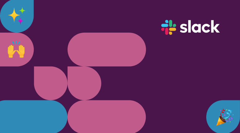
Types of brand shapes
Our brand shapes are core visual elements drawn from the octothorpe mark in the Slack logo.
Chat bubble
Chat bubbles should be scaled proportionally. Don’t combine chat bubbles and pill shapes into a single form.

Pill
Pills can be shortened or extended based on the application. Don’t combine pills and chat bubbles into a single form.

Toolkit
Please use the shape toolkit we’ve provided here. It contains patterns, backgrounds and more—all ready for you to use right away. There’s no need to create your own.
Applications
Here are examples of the different ways brands shapes are used in design.
Container
Single shapes can be used to contain illustrations or photography alongside a headline.

Pattern
Shapes can be built into patterns to frame main elements like messaging, emoji or imagery. They are of secondary focus in the design.
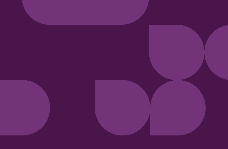
Background
Shapes can appear as background elements to provide visual interest and texture. These should be built on a grid and feel orderly versus random.

Design considerations
Brand shapes work alongside copy and images to bring focus to a design and express our personality. Before you dive in and start using shapes, here’s a few things to take into account.
Scale
Scale shapes to create simple backgrounds and patterns. For use with imagery, stick to fewer, larger shapes for greater impact.
See our shape toolkit for more details on how images are structured within shapes.

Solid vs. stroke
We use solid shapes more often, but stroke shapes can be used for variation. Use them sparingly and only in addition to solid shapes.

Color
Use our core and secondary color palettes. Don’t use too many colors, as that can distract from the overall design. For monochrome patterns, use a tint or shade of the background hue to create contrast.
See more details on how we use colors, see our shape toolkit.
Images
Single shapes are used to frame photography and illustrations. The images should be anchored to the bottom of the shape, but can extend past the top or the side of the shape.

Alignment
Arrange brand shapes on a grid by default unless it’s limiting to the overall design. They can be rotated, but only at 90 degree angles. Do not overlap shapes.

Motion
Shapes can be animated to function as accents, transitions or background fills. For more details on using our brand shapes in animation, see our
motion guidelines.
Usage

Don’t create new brand shapes; please use what is provided in the toolkit
Don’t overwhelm patterns with too many colors, too close together
Don’t overlap shapes or add effects like drop shadows, inner shadows or bevels
.svg)


.svg)
.svg)
